

Creating Bluey: Tales from the Art Director - Chapter 2
Let's dive into the nuts and bolts of how Bluey is designed


Step 1 - Reference Gathering
For every Visual Development project the first thing I do before I even put pen to paper is gather reference. Both photographs and artistic inspiration. Ideally I’ve got a day or two to sit down and gather everything up, absorb it like a sponge, then synthesise it into the early visual exploration.
For Bluey I already had an exhaustive library of Queenslander homes from my own collection. Joe wanted that quintessential Queenslander architecture to be the defining feature of the Heeler Home. As mentioned in the first chapter, overall he wanted to show off the colour and beauty of South East Queensland.
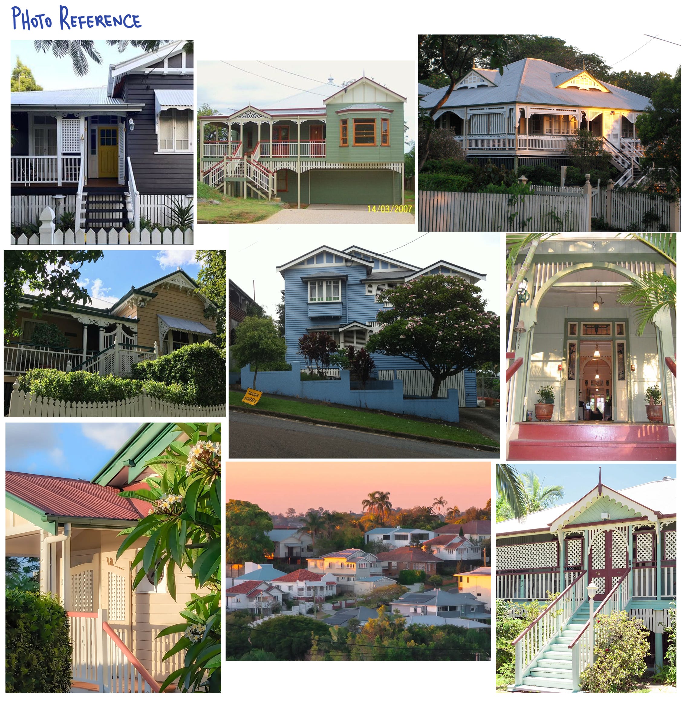
It was also a big priority, due to it being for preschool age children, that the show backgrounds be super simple. The backgrounds also needed to build off the characters that had already been locked and designed. Out of this reference gathering phase came three key ideas I wanted to implement into the style to hit all of these needs.
1. Graphic Representation of Space
I thought it would be a good idea not only to simplify the details of our Brisbane setting, but stylise and simplify how we portrayed ‘space’ in a more graphic, less literal way. Local Brisbane artists Katy Edwards and Debra Hood perfectly captured this idea already. The space and stylisation of their paintings are flat, stripping away camera angles and lighting to bring all the beautiful details of Queenslander architecture into full focus.
In particular I had grown up around Edwards’ paintings and they were very close to my heart. It made it feel like the way she saw Brisbane was already an indelible part of the cities’ visual fabric.


2. Dollhouse Proportions
Going with really cute, simplified proportions was not only a no brainer due to the size and shape of Bluey’s characters, but something about miniaturised proportions is so engaging. There’s gotta be something buried deep in the human subconscious that contributes to how beguiling it is…


3. Brisbane Colour & Light
After travelling further afield in adulthood, but always returning to traipse around Brisbane, I can say with certainty the light there is unlike anywhere else. It paints everything golden, throwing the corrugated iron roofs of Queenslanders’ into electric blue shadow. Saturating the purple Jacaranda blooms and red Poincianas.
Local painters like Jan Jorgensen succeeded in capturing that light. The crappy plein air painting I had been doing were…trying. If we were going to have Brisbane be the backdrop, not straying too far from the source in terms of colour and light would be key.


What ultimately all these ideas stacked up to in my head was a style that was extremely appealing.
Appeal is such an intangible element to visual art, I could try and harp on in some pseudo-scientific way about what I personally think creates that deep satisfaction when viewing something ‘visually appealing’. I think there’s a whole weird matrix of things firing off in our monkey brains to illicit it. But I’ll just leave it at: we know it when we see it. I wanted to make something that was truly delicious to look at.
Step 2 - Building the Shape Language
A fundamental part of both character and environment design in animation is shape language. Here’s a little crash course.
Circles, Triangles and Squares are the 3 basic building blocks of all other shapes.

These shapes have concomitant meanings and feelings for humans. As Visual Development Artists, we draw upon these subconscious connections to help amplify and communicate character and personality in our work.

Circles are round, friendly and soft. No hard edges!

Triangles are sharp, aggressive and evoke pain

Squares are sturdy, steady and firmly planted.
Then on top of that, even directional lines have implicit associations!

Horizontals are calm, Verticals awake and upright, and Diagonals off balanced.
Tapping into, combining, or even subverting the expectations of each gives us infinite combinations to play with.
For Bluey, we already had our characters ready to go, this made the decision about where to head with the shape language an easy one. Just like the characters, the world would be built out of big, friendly, rounded rectangles.

This helps unify the world. When there’s an overwhelming amount of choices to be made about architecture, furniture and everything right down to the knobs on kitchen cupboards, it takes all the guesswork out of the little details
Now that you know all this: pop quiz smart arse!

Part 3 - The Bluey Bible
With all this combined, we arrive at the key rules of our Style Bible. This is a document made for the crew with all the do’s and don’ts of the Bluey style.
No literal dog gags
Small visual nods within the world to the fact that they are dogs can be a part of Bluey, but nothing too on the nose.

Everything needs to fit the characters
Keep objects cute, simplified and chunky, with doll house proportions.

Straight Ahead Camera Staging
The majority of Bluey camera staging is straight ahead and very flat. The ground plane needs to be level enough to have the characters act out scenes in a graphic, straight ahead style.


Flatten & Simplify Space
Stylise and flatten more complicated environments and perspectives to create simplified designs that focus on the essential appeal of Brisbane and the suburbs of Paddington/Red Hill.


Harness ‘Reverse’ Two Point Perspective
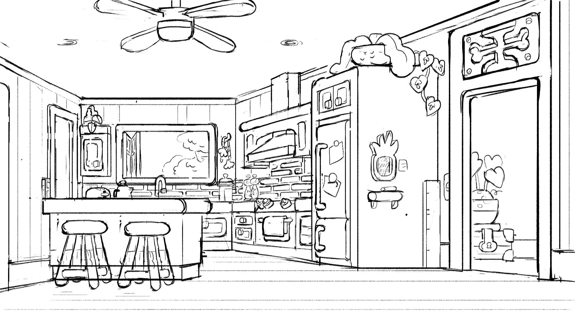
This one is a bit of a geeky thing, so for the non-artists, I won’t judge you if your eyes glaze over for this part. Bluey backgrounds appear to be 1 point perspective. We have very flat backgrounds and almost all of our planes facing camera have flat edges, which is usually a dead giveaway indicating 1 point perspective.
However, 1 point tends to get a little cramped. For example, this initial sketch of the Heeler kitchen just doesn’t have enough acting space for the characters.
This second take is exactly what we needed. It’s still flat, but far more expansive. How did we do this?
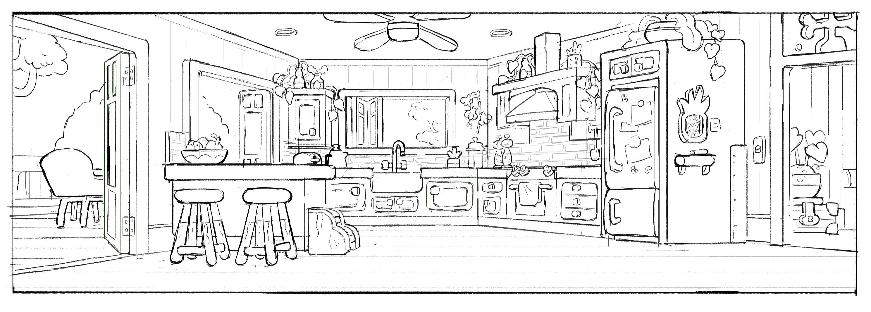
The key is actually making it a 2 point perspective background. Edges facing to camera stay flat, but you expand your vanishing points from opposite sides of the back wall. It’s 2 point essentially functioning as 1 point. Or maybe it can be described as you’re inside the 2 point perspective cube you’re drawing, rather than outside of it. Whatever makes the most sense!

I don’t even know if there’s a formal name for this. It’s something we figured out while trying to problem solve, and stuck with it. This cheeky little trick means everything is still in perspective, but you have a nice wide ground plane for characters to act out scenes in a graphic, straight ahead style.
Colour Style
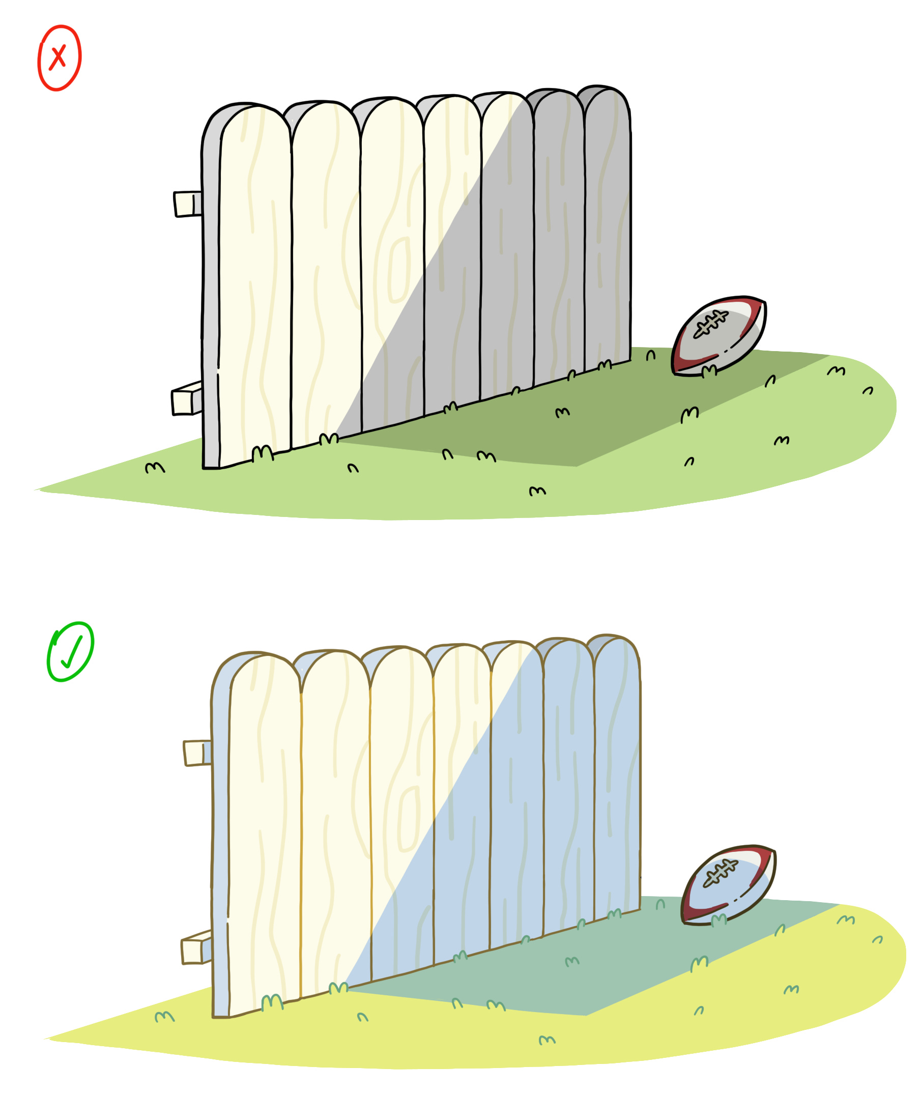
Colour and Light in Bluey should be a simplified and slightly more vivid representation of the light in Brisbane. Do not use black lineart, instead colour lineart relative to the local object and light affecting it. Avoid neutral shadow tones. Always err towards more colourful choices with lighting. When in doubt, bump it cooler, or warmer than the local object the light/shadow is affecting.
Next Week on Creating Bluey - Tales from the Lead Art Director
CHAPTER 3
Blood, Sweat, Meat and Potatoes
What’s it really like creating an animated show? We get into all the highs and lows that went on behind the scenes.
Nghhhhhh love these insights! The dollhouse look was such a great direction to take the design in. And you knew Jan Jorgensen!! 🥹🙌🙌🙌
Thanks for sharing all of the thought, skill, and care put into the show!